Friday, October 31, 2008

Notes #15: Form

Breaking up the structure is an intense process. Some spaces deserve a kind of monotonous typology, and others something more evolved. Lack-of-space has affected the way the structure is composed. Second and third tier elements come into play to create what the typology cannot. Along these lines is a subtle narrative of evolution, growth and deformity.

Going against the typology because the structure has dictated a need has expressed the differentiation in the model. The adaptation of, and the subtraction of the form have different effects. The former seems to be denoting growth and the latter denotes external manipulation, possibly a mode to analysis, the isolation of a set unit or quantum of desired proportion.

Thursday, October 30, 2008

Notes #14: Landscaping

Landscaping has a tentative property with its surroundings. The conscious decision of association serves as an expression. A narrative can be obtained between the land and the built form.

Is the building, as it is now, a protrusion on a flat plane? It can be perfectly justified in being the protrusion on a flat plane. That the object is meant to be studied in isolation as the scientist would. To give it context would compromise it, bias it as the object would become subject.

Re-interpretation
The idea of a flat plane can both be an objective one, and a subjective one. Providing a sterile environment has a similar effect on the built form. The flat plane is almost impossible, given the effect of neighbouring properties, so the edge condition must nullify the effects of neighbouring properties.

Wednesday, October 29, 2008

Progression (29/10)

Today I focussed upon re-designing the first 7 units and the tower, with also a few construction details of the single unit structure. Here's a few images to keep my neighbours updated.

Tuesday, October 28, 2008

Notes #13: Compression

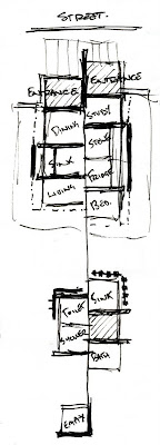
Hejduk's proposal for separating the house into basic units, each of an essential simplified purpose, has presented some interesting problems. I interpreted the principle for this methodology as being a device to better understand and design for the specific requirements of the units themselves and how they relate. Consequently some units have an abundance of space whereas others seem to be severely lacking.

The unit size for my clients dwelling is 2000x2000mm, and in the units housing the bath sink, the bathtub, the shower, and the toilet, this amount of space seems vast. In contrast, the units housing the kitchen sink, the kitchen stove, the dining table and chair, the refridgerator, the sleeping bed, and the study table and chair are cramped, almost crowded by the items themselves.

The original grouping of elements into their associated, or, closely related uses and then separating these groups brought about the idea that these units are growing along a single line, but then become deformed in their growth. An over-excitement in growth between the single unit and then the cluster of 4 would breed an abundance, and then a flaw in the growth from the cluster of 4 to the cluster of 7 would have some negative effect. It seems now that the amount of space has presented a very subtle narrative to explain the associations between these clusters of units in this adaptation of the dwelling.

Re-inforcement
The association between the internal layout of the units and the dividing line/wall is quite a difficult one to consider. Since the dividing wall's original purpose was contradictory, to serve as a corridor to feed the units, it seems appropriate to use it in the same manner in this design, though it is now more of a threshold between each unit.

The spatial arrangement of these units could be used to reinforce or disguise the connective properties of the dividing wall, whether it is associated with the internal plan or disconnected from it. Each unit can have a principle wall, where the service it houses is located, similar to a servery wall. Each unit can also choose which direction its functions should address, the location of seating, the orientation of devices. This solution for interior may inhibit several other design considerations, like the association between interior and exterior, relations between units and circulation paths.

Friday, October 24, 2008

Progression (24/10)

Here's a few quick snapshots of my current design. Based on the typologies I studied earlier I've adapted several techniques to divide a 'typical' facade into unit structures. The images are in a sketch form as I'm still uncertain how the design will finalise. Currently I'm working on developing the interior and resolving some space issues.

The Eastern facade facing Ella Camporeale's site

The Northern facade facing Third Street, Brompton.

The Roof Plan

As you can see there is a lot more to develop. The building should stretch the entire 30m of the site and roughly lie in the centre, though that might change given some boundary conditions that may arise. The developed eastern facade was merely a test to manipulate typologies, so I wouldn't expect it to look exactly the same in further updates.

Sunday, October 19, 2008

Notes #12: M.O.R. Typologies

Taking the wooden horse criterium into account, I've begun to model up several street facades based on local and stereotypical typologies. I've noticed that with each progressive model certain decisions have presented themselves as important. The lateral flow is crucial to the facade, deciding what elements shall be divided and what shall be preserved has a dramatic effect on the typology.

Thursday, October 16, 2008

Notes #11: Model Comparison

Since the last entry the model has changed substantially, and I think it might be beneficial to compare the two as a form of a critique. Below, on the left, is the model form two weeks ago, and on the right is the new model with a few attempts made to explain the excited connection between the single unit and the rest of the building, and the 'dead' units added to deform the structure.

The excess of curves has led to a confusion, or rather, a contradiction in the original concept. More curves than units has blurred the association between these two elements. The 'excited' connection to the single unit also looks out-of-place. I think this connective device may suit the previous design better, and the pattern in this connective device might serve a use in the simplification of the design for the wooden horse.

The distortion caused by the dead units has had a negative effect upon the rest of the model. They need to be re-thought for the final, as they are also the most exorbitant structures within the design.

The slope in the units' parapet walls is something crucial to the sculpture, it reduces the hardness of the edges and reinforces the folding notion.

Translation
In the model, its repetitiveness needs to be exemplified. Reducing the curves to a single straight line and adopting the pattern from the excited connection of the latter model would be best. This might translate as an axis similar to ones present in nearby properties, and might serve as a privacy wall.

The connection points should be like typical extensions, where the structure's sibling is attached to the structure, but not of the structure.

The tower could be a parapet walled street facade element, or resemble a portico structure

The empty unit might be a skillion roofed extension.

the windows might be unusable balconies on a non-existant first floor, above the entrance.

Symmetry is crucial.

The interior will provide the best example of the sculptural form of the building.

The garden/landscape needs further thought.

Monday, October 13, 2008

Notes #10: Local Typology

After mocking up the site in Sketchup a few typologies of the local vicinity have become apparent. Within the area low to medium density residential buildings is predominant. The site has also some notable industrial buildings that break up the streetscape.

The use of Gabled roofing is something very common. This roofing doesn't extend much past the exterior wall, the overhand being determined by the fascia + gutter depth. Its something homogenous and typically irrespective of the building's context. If shelter is required, the verandah/patio/portico is used.

In tudor-style gable roofing, the irregular floor plate is expressed through variations and complexities in the ridge-line. The roof becomes a re-interpretation of the spatial arrangement. Marks of contextual efficiency are noted when the ridge-line continues to meet an external wall, though this condition rarely exists on the street facade.

When the above condition does exist on the street facade, care is taken with respective proportion, often associated with an extension of another parallel ridge-line.

Extension of the main ridge-line as in the above image is also common over the site, which can be seen as a typology of traditional housing.

Combination skillion and parapet roofing is more common to the industrial buildings of the site. However, when used in residential buildings, there is a greater consideration for the street-side facade, often broken up by a continuous facade entity like a verandah.

In combination eaves and parapet edged roofing, parapets along the street-side facade are used to break up continuous facades into the building's respective units. On any other facade they tend to be used to shield against uncomfortable neighbourhood conditions. In the example below the walling is used in two ways. It simplifies the building fabric whilst also addressing, rather bluntly, the neighbourhood condition. However, in most examples around the site, its merely a device for efficiency.

Symmetry is another typology common to the site. Large housing is mirrored around a central axis, however this axis is not directly or intently expressed in the facade. Expression comes through secondary devices, such as fencing and external privacy walls. The privacy wall aren't the best example of efficiency, however, symmetry seems to be a common sign of low-cost building in the neighbourhood, though this might have more to do with unit housing rather than symmetry.

There is a predominant use of verandahs around the site. In most cases they are separated from the roof line by a fascia and a few courses of brick line. Most address the street facade and serve as a large intermediary space between the exterior and the interior. This intermediary space is also present in the form of patio's and portico's, but their size is significantly smaller. The latter spaces are also more an extension of the house.

Extensions in the the garden are common and are marked by skillion roofing, resembling a verandah-esque structure attached to the main building.

Where possible, garages are positioned on the street facade, but it seems more efficient to group parking together for the surrounding units at the rear of the properties.

The priority in facades is first to consider the streetscape, then the garden, and then to address the neighbours, thus there isn't much consideration for the neighbouring facades. Fencing merely prioritises the streetscape.

Where a first floor exists, balconies are used for two purposes; to provide external access for the first floor (logically), and to shelter the ground floor. For this reason they are found on the street facade, above the entrance, and in most cases, are severely undersized for any kind of practical use.

Repetitive elements are common in more ways than one. Unit housing is highly repeditive in the region. Elements like the typologies mentioned before are strewn throughout the site, with little comparative difference between each occurence. Differentiation is not a priority.

Thursday, October 9, 2008

The Wooden Horse

The final submission asks us the make a model of a building that camouflages itself as something else, based loosely on the fall of Troy. It focuses on adapting the mystery play model into a real-life environment.

The suburb is Brompton, which is 'has a tradition of social housing, principally driven by the establishment of a number of cooperatives intended to pool the resources of a number of individuals and families'. We are asked to cater for this type of social construction.

An Atlas SA Metro Aerial 2007 image of the site.

HI-RES Metro Aerial 2007 image
NB: Max image size in sketchup is 1024x1024, so the image should be cut into 1024px blocks to import it at high-res